
Advanced Features
Advanced Features
What are advanced features?
Advanced features are generated by AutoFE algorithm using original features in the dataset and operators enhancing the representation power. Advanced features usually have different high-level interpretation perspectives from each other, so they are equally important to ML model. Thus our algorithm generates a feature group with the greatest gain to the model performance.
How to view advanced features?
You can click the Model param button of the corresponding task to view the basic information of the training model, as shown in the following figure:

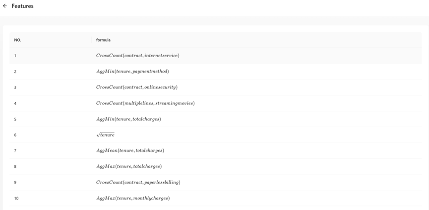
The figure above shows that 24 high-level features are generated using an AutoFE algorithm.
By default, the system will only display the first advanced feature. When the number of features generated is greater than one, you can click “Click to get all advance features” button to view all advanced features. The system will list all advanced features we found with LaTeX formula.
Download Model
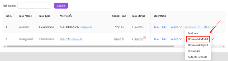
How to download model?
You can click the “Download model” button of the corresponding task in the “operation” column to download the trained ML model. As shown below:
Model File Structure
You will get a compressed file named model_*.zip after downloading the model file, which records all information about the model and related metadata.
You will extract a folder named “result” using a decompression tool, as shown in the following figure:

The folder can be roughly divided into the following parts:
l example.py files:These files are code samples of ML model usage generated by our platform, including use for new data predictions, or reproduce model without our platform.
l result folder:This folder stores metadata and other relevant files in the model training process, including AutoFE, AutoML, and modeling task configuration files.
These code requires our library called “changtianml” in the Python public warehouse PyPI , through which the dependency library can be more portable and convenient for users. You can easily do your own magic with ML models, make integrations to your own applications and more starting with downloaded models.
At present, the tool library is still in continuous iteration and improvement, keep updated to know new features!
Model Metadata
Modeling Task Configuration
The configuration information and advanced parameters involved in this modeling process are stored in the config.yaml file.
AutoFE
|
File Name |
Description |
|
features.csv |
Advanced feature list (Latex formula style)) |
|
record.csv |
Advanced feature list details (CSV format) |
|
result |
Advanced feature list details (JSON format) |
|
labelencoder.pkl |
Automated feature engineering model binaries |
|
dfs_log |
autoFE log |
AutoML
|
File Name |
Description |
|
result |
autoML binaries |
|
val_res |
Validation set prediction result file |
|
val_logs |
Validation set evaluation metrics file |
|
logs |
autoML logs |
Offline Predictions
Apart from make predictions online using “predict” button, you can also make predictions offline using downloaded models. The specific steps are as follows.
Download Model
Click the “Download model” button to download the model that has been trained by the task. At this time, a compressed file will be obtained, and the general content after decompression is as follows:

Install Prediction Environment
Based on the conda/Anaconda environment, which is a tool for quickly installing the Python environment, you can run the following command to set up the prediction environment:
|
# Create a Python virtual environment conda create -n changtian python==3.10 -y # Activate virtual environment conda activate changtian # Install predictive frame dependencies pip install changtianml -i https://pypi.tuna.tsinghua.edu.cn/simple/ |
Well done! The prediction environment is completed!
Model Prediction
At present, the platform has released the library “changtianml” in the Python public warehouse PyPI, which can be more portable and convenient for users to make predictions and other related work.
The model can be run by referring to the example.py sample file provided by the platform. The comments in the file explain the functions and basic usage of the library in detail. Please read it. Here is a piece of code for reference only:
|
# Import platform-related dependencies from changtianml import tabular_incrml
# load the model in directory “res_path” res_path = r'result' ti = tabular_incrml(res_path)
# start the prediction using test data’s path test_path = r'test_data.csv' pred = ti.predict(test_path)
# Output prediction result print(pred) print(ti.predict_proba(test_path)) |
Model Report
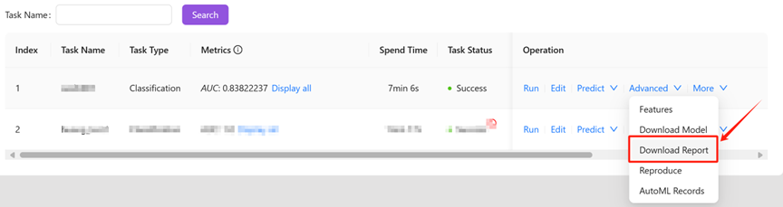
How to obtain model report?
The platform can not only generates a ML model , but also gathers remarkable insights and findings about the dataset and the ML task during ML process in model report, which provides insights for better understandings the data and the task.
You can click “Download report” to obtain the model report, as shown in the following figure:
After downloading the file, you can obtain the report_*.zip file. Decompress the file using the decompression tool to obtain the model report.
Model Report Interpretation
The platform will automatically generate a compressed model report for users, and the content after decompression is roughly as follows:
This includes the original image folder and report files in different formats (Word, PDF and Markdown are supported).
Below we will show you how to access the relevant contents of the report through a model report of an example classification task.
The report provided by this platform includes three aspects: feature distribution of training data, model visualization, and various indicators of validation data.
Feature Validity Analysis
Note that the following metrics, including some “importance” metrics don’t mean any replaceability among features because advanced features are interpretations from different perspectives.
We provide various feature validity analysis methods, which can be simply divided into before-training methods and after-training methods. For example, before training, we can select high relevant features to reduce model complexity. After training, if we use a tree model, we will get the importance value of each feature, which can also be used to repeatedly adjust our trained model.(For the sake of the length and brevity of the report, we only analyze and output top part of the data.)
1.Data Analysis Before Training
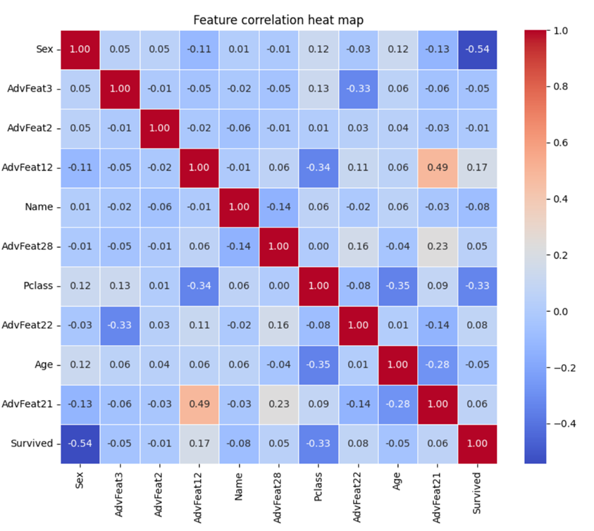
1.1 Heat Map
Heap map shows the correlation between features. Here is the correlation between the top 10 features of the model feature importance and the label.
The correlation coefficient calculated here is the Pearson correlation coefficient, and its formula is as follows:
ρX,Y=cov(X,Y)/ σX *σY
The Pearson correlation coefficient measures the linear correlation between two variables and ranges from -1 to 1. Specifically speaking:
l 1 indicates a perfectly positive correlation: when one variable increases, the other variable increases by an equal proportion.
l 0 means no correlation: there is no linear relationship between the two variables.
l -1 indicates a perfect negative correlation: one variable increases and the other decreases by an equal proportion.
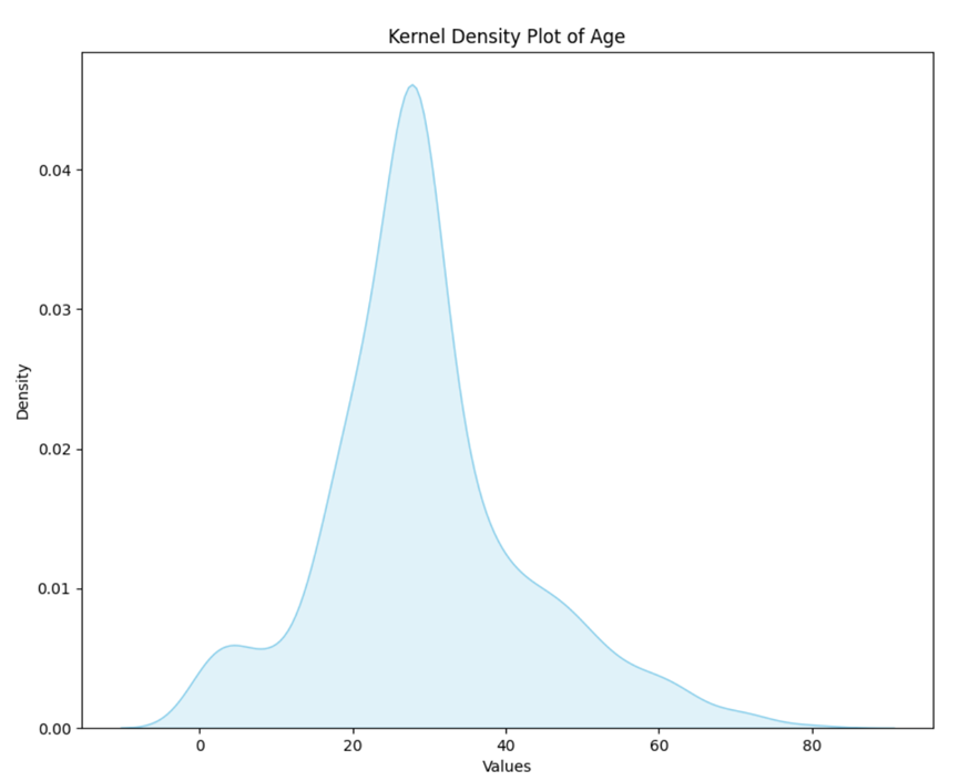
1.2 Kernel Density Estimation(KDE)
Kernel Density Estimation (KDE) is a nonparametric method for estimating probability density functions. It places a kernel (usually a normally distributed kernel) around each data point and then accumulate kernels and form a smooth estimated probability density function.
At present, we choose advanced features or primitive features with the largest feature contribution for kernel density estimation.
Kernel Density Estimation maps can help you understand the distribution of individual variables, including peaks and the shape of the distribution. The data can be analyzed from the following two aspects:
1.Peak value: The peak represents the height of the highest point in the probability density estimate plot.
l In KDE, the higher the peak, the higher the density of data points at that location, that is, the more concentrated the data points near that location.
l The height of the peak does not directly give a probability value, but can be used to compare data density at different locations.
2.Overall shape: The overall shape of the probability density estimate map reflects the trend of the data distribution.
l The smoothness and volatility of the graph can be used to judge the variability of the data.
l For example, a flat KDE plot indicates that the data is relatively evenly distributed, while a graph with peaks and fluctuations may indicate that the data is more dense in some areas.
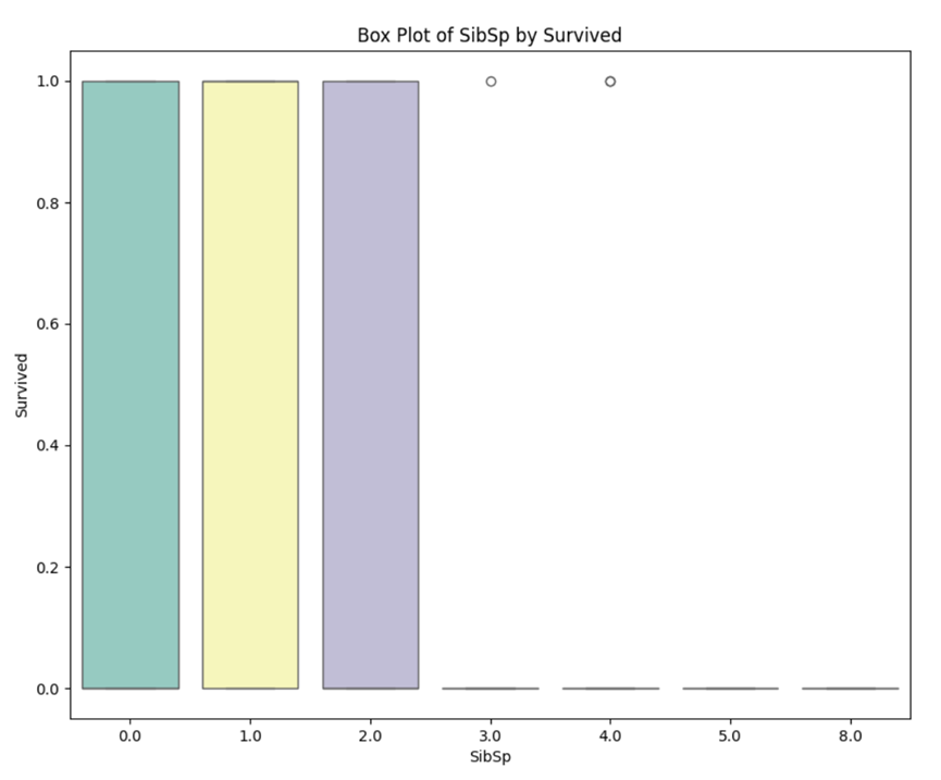
1.3 Box Plot
Box plot is an effective tool for visualizing data distribution and outliers.
At present, we choose the advanced feature or the original feature with the greatest feature contribution to draw the boxplot.
When analyzing a boxplot, you can focus on the following key elements:
(1) Box: The box shows the quartile range of the data, i.e. the middle 50% of the data.
l The bottom and top of the box indicate the 1st quartile (Q1, lower quartile) and 3rd quartile (Q3, upper quartile), respectively, while the lines inside the box indicate the median (Q2).
(2) Whiskers: Whiskers must extend from both ends of the box to represent the maximum and minimum values of the data, but do not take into account outliers.
l The length of the whiskers is usually based on the distribution of the data, and the specific calculation method may vary.
(3) Outliers: In a boxplot, data points that exceed 1.5 times the required quartile distance are usually defined as outliers and are represented by points.
l An outlier may be an outlier in a data set.
(4) Overall shape: Looking at the overall shape of the boxplot can provide information about the distribution of the data.
l For example, the length and position of the box, the extension of the whiskers, and the distribution of outliers.
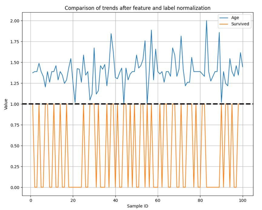
1.4 Feature and label feature curves
Seeing if trends in features and labels are consistent can help build more efficient, interpretive, and generalizing machine learning models.
At present, we select the advanced features or original features with the largest feature contribution for curve drawing, and select the first 100 samples for display.
We normalize features to between [1, 2] and labels to between [0, 1].
2.Feature Analysis After Training
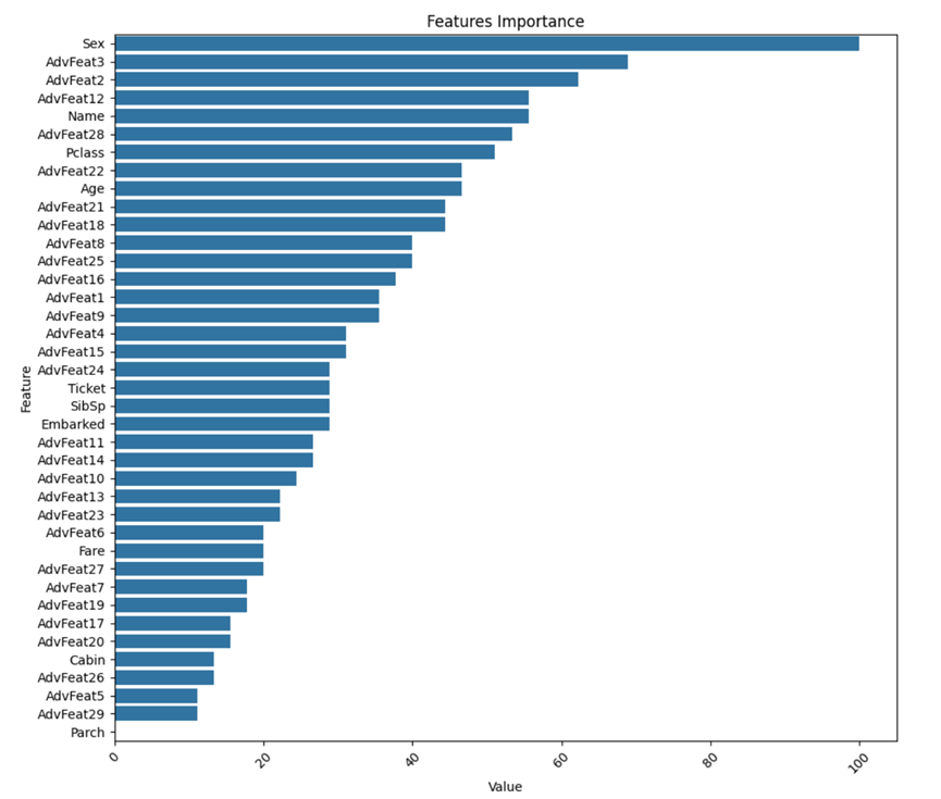
2.1 Feature importance
The degree to which each feature contributes to the tree model, the following is an overview of the feature importance scores for common tree models.
(1) LightGBM:
LightGBM uses a tree-based learning algorithm, and feature importance is mainly based on Split Gain.
(2) CatBoost:
CatBoost is also a tree-based learning algorithm, and its feature importance calculation is similar to LightGBM, mainly based on split gain.
(3) XGBoost:
XGBoost assesses the importance of a feature by calculating its Gain.
XGBoost also provides a way to calculate the importance of features based on Coverage, which represents how often each feature is used in the tree.
(4) Random Forest:
Random Forest uses indicators such as Gini impurity or Information Gain to select the best fragmentation features.
The sum or average of these times can be used to measure the importance of the feature.
(5) Extra Trees:
Limit trees are a variant of random forests that use more randomness when nodes split. Feature importance is calculated in a manner similar to that of a random forest.
When the tree model is split, it may use the same feature several times, and the importance of its feature is the weighted average of these nodes. Different models have different strategies.
3.How to Analysis
The general manual ML process for machine learning is as follows:
(1) Data analysis to understand the distribution of data, such as:
Check for redundancy: In general, if the absolute value of the correlation coefficient between features in the thermal map is greater than 0.8, the feature selection should be carefully considered.
View the correlation between features and labels: In general, the higher the correlation coefficient between features and labels in the thermal map, the higher the importance of the features is likely to be.
Look at the probability density distribution of features: Determine if the data is dense, which may result in a small degree of differentiation.
Other methods.
(2) Feature engineering
For example, if the correlation between feature A and feature B is very low, A simple combination of feature A and feature B (such as addition, subtraction, multiplication and division) can get feature C, and feature C may be of great help to the model.
To take a simple example, let's say we measure the level of obesity. We have height (
h) and weight (w), w÷h2 is a feature discovered through feature combination.
This feature contributes significantly to the classification, and that's BMI, which gives it the physical meaning of body mass index, a measure of how obese people are.
(3) Model tuning
Model tuning is mainly divided into two parts: selecting the most suitable model and selecting the best model parameters.
Feature engineering and model tuning generally go together, and it can be simply understood that different data sets should correspond to different optimal models. Then these two steps will take a lot of time and effort to achieve.
Data analysis using Incresophia:
l Now that you have a valid combination of features, you can reversely research about the meaning of the new feature, for example: we can explain BMI above: In order to consider the obesity degree of different height, we adopted the division method. The introduction of the square term makes the index more sensitive to the change of height, so as to better reflect the ratio of weight to height.
l If you need more detailed data details, you can use the “changtianml” pypi library for analysis.
Model Visualization
Model visualization currently only supports LightGBM, if the final model is not LightGBM, then this part of the image may not be generated. Visualizations of other models are under development, so stay updated!
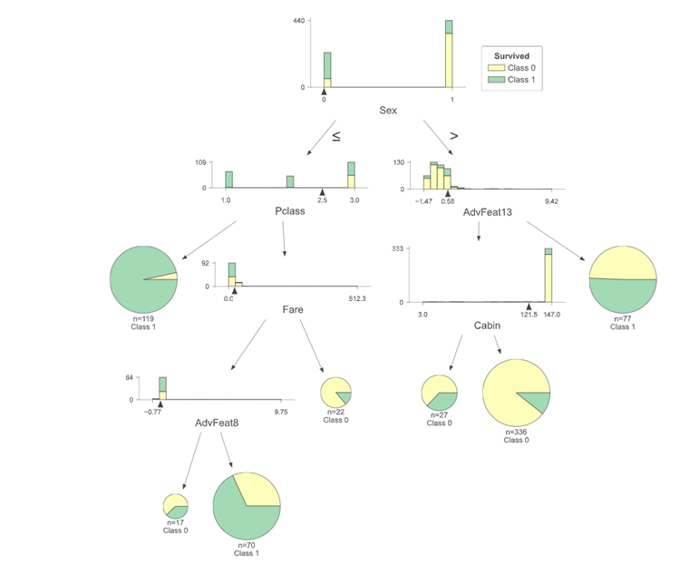
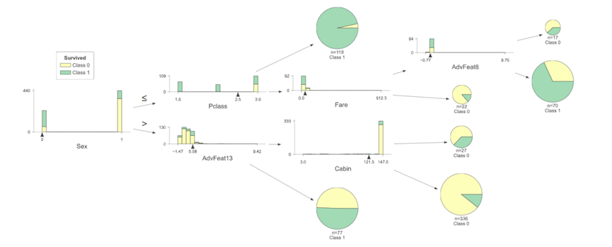
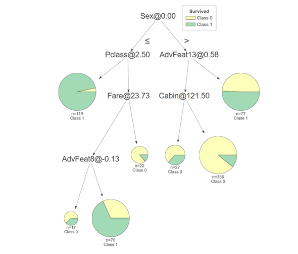
1.Structure Visualization of Tree Model
Importance of tree model visualization:
(1) As an interpretable model, you can clearly see the split conditions of each decision node and the predicted results of the leaf nodes. This helps to understand how the model makes predictions based on input features, making the working process of the model more transparent and explainable.
(2) You can understand the impact of features on the prediction result, such as whether feature A places the data into the correct category at a certain threshold.
(3) A visual tree model helps explain how the model works to non-specialists, stakeholders, or team members
The following describes the display of vaqrious tree models.
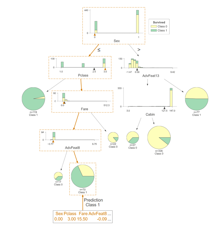
Interpretation of tree model diagrams
l Select the feature Xi, and the feature will split according to the threshold Si . The left is less than or equal to the threshold Si , and the right is vice versa.
l If a good result is obtained in the split sample, the split is stopped, and if not, the feature Xi split continues to be selected.
l Repeat the two steps above until all samples have been assigned.
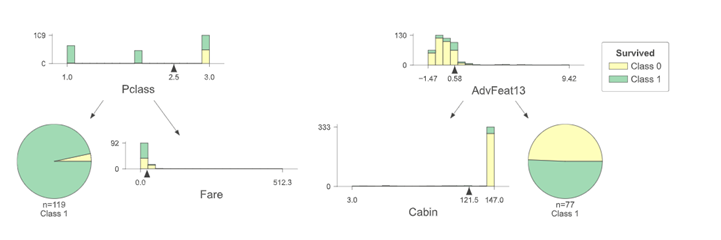
Vertical expansion of the tree model
Horizontal expansion of the tree model
Simplified expansion of the tree model
A shallow expansion of the tree model
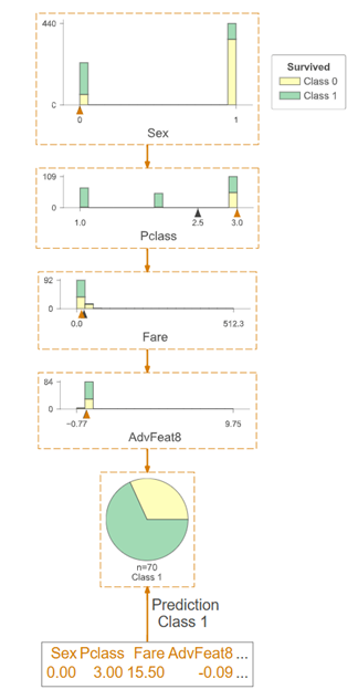
2.Prediction Path of Decision Tree
The prediction path of the decision tree can visualize the process of seeing how the model determines which classification label a particular sample belongs to.
The full prediction path of the decision tree
The prediction path has been marked with orange boxes. A random sample of the test set is selected and the specific information of the sample is listed below.
Prediction path simplification of decision tree
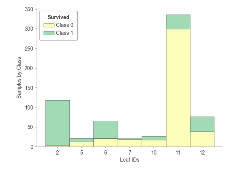
3.Tree Leaf Node Sample Tree Statistics
The statistics of how many samples are included when each leaf node of the tree model is trained.
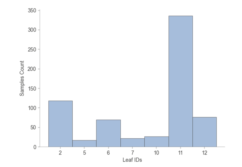
The training of each leaf node of the tree model includes statistics on how many samples, and how many of each leaf node belong to each category.
Validation Set Metrics
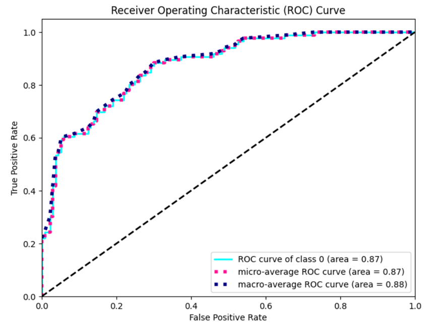
ROC curve and confusion matrix currently only support classification tasks with output categories less than or equal to 5.
1. ROC Curve
The Receiver Operating Characteristic Curve (ROC Curve) is a graphical tool used to evaluate the performance of a classifier. Focus on two important performance metrics: True Positive Rate (TPR) and False Positive Rate (FPR).
True Positive Rate (Sensitivity or recall rate): TPR represents the proportion of all actual positive cases in which the model is successfully identified as positive. On the ROC curve, TPR corresponds to the vertical axis, ranging from 0 to 1.
False Positive Rate (False positive case rate): FPR represents the proportion of all actual negative cases in which the model is incorrectly identified as positive. On the ROC curve, FPR corresponds to the horizontal axis, again ranging from 0 to 1.
Meaning and use:
l Model comparison: ROC curves provide a visual tool for comparing the performance of different models. The area under the curve (AUC) is used to quantify the performance of different models in the entire ROC space, and the larger the AUC, the better the model performance.
l Threshold selection: The ROC curve helps select a classification threshold. Different application may pay different attention to False Positive Rate and True Positive Rate. You can balance the false positive rate and true positive rate by adjusting the classification threshold.
l Diagnostic performance: ROC curves show the performance of the model at different operating points to help you understand the diagnostic performance of the model, especially in binary classification problems.
l Not affected by class imbalance: The ROC curve is more robust for class imbalance problems because it is based on the proportional relationship between true and false positive case rates.
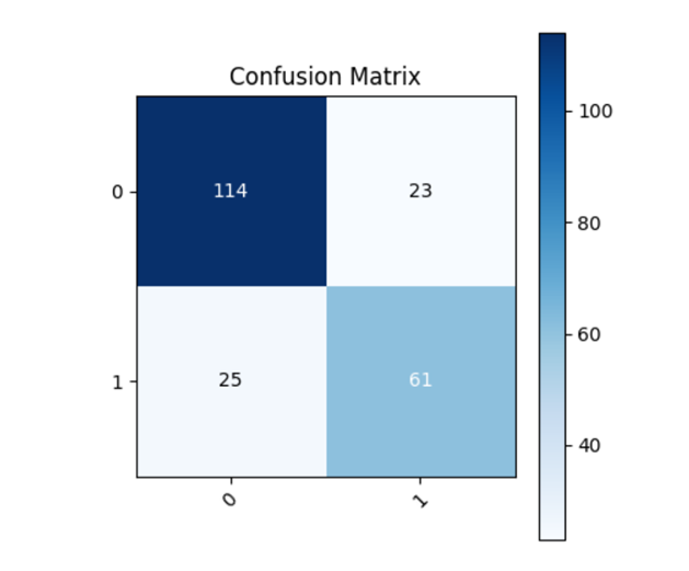
2.Confusion Matrix
Validation set metrics (Accuracy, Recall,Precision,F1) can be obtained in AutoML of the task log.
True Positives(TP): The model correctly predicts positive examples as positive examples.
True Negatives(TN): The model correctly predicts negative examples as negative examples.
False Positives(FP): The model incorrectly predicts negative examples as positive examples.
False Negatives(FN): The model incorrectly predicts positive examples as negative examples.
The meaning and use of confusion matrix:
Performance evaluation: The Confusion Matrix provides a comprehensive performance evaluation that provides an intuitive understanding of the model's predictive accuracy across different categories.
Accuracy calculation: Accuracy is the proportion of the total number of samples correctly predicted by the classifier to the total number of samples, which can be calculated from the confusion matrix. Accuracy=(TruePositives+TrueNegatives)/TotalSamples, The accuracy of this task is 0.7847533632286996.
Recall calculation: The recall rate (also known as sensitivity or true case rate) represents the proportion of positive cases correctly identified by the model out of all actual positive cases.
Recall=TruePositives/ (TruePositives+FalseNegatives) ,The recall rate of this task is: 0.7847533632286996.
Precision calculation: Accuracy represents the proportion of samples that the model predicted to be positive examples that actually were. Precision= TruePositives/(TruePositives+FalsePositives),The accuracy of this task is 0.7839107317605237.
F1 Score calculation: The F1 score is a harmonic average of accuracy and recall, which is used to consider the accuracy and comprehensiveness of the model.
F1= 2*Precision*Recall/(Precision+Recall),The F1 of this task is 0.7842670856605463.